Technology
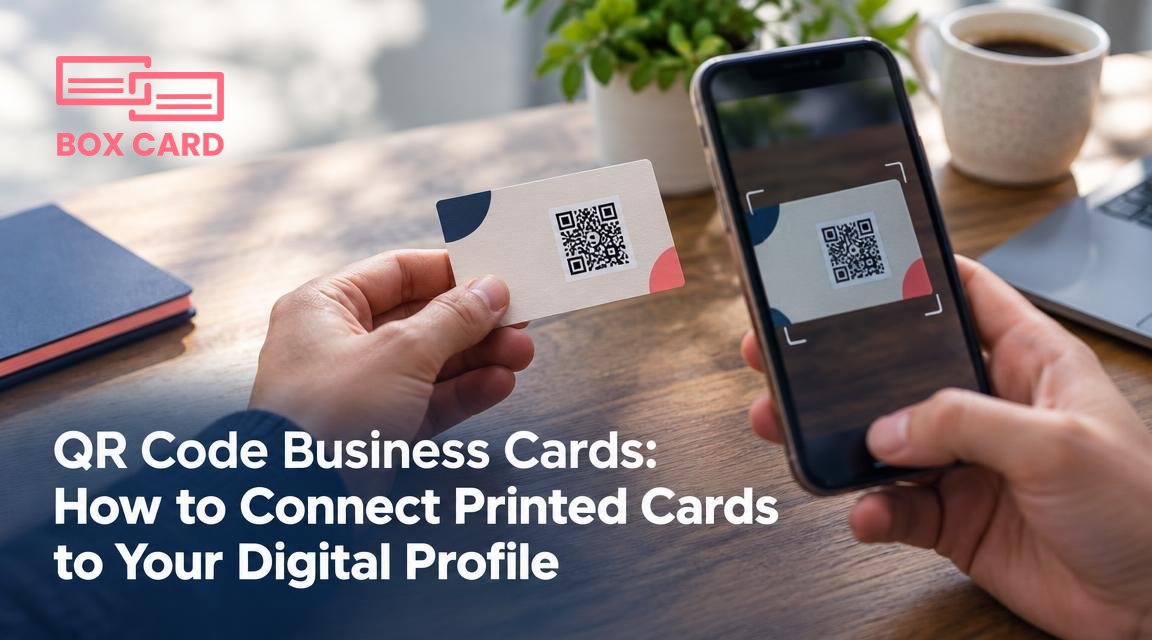
QR Code Business Cards: How to Connect Printed Cards to Your Digital Profile
A QR on your printed business card can instantly connect paper to phone, but only if you choose the right payload, format, and print settings. This article gives practical rules, tests, and a step by step workflow so your QR reliably delivers the contact information you intend.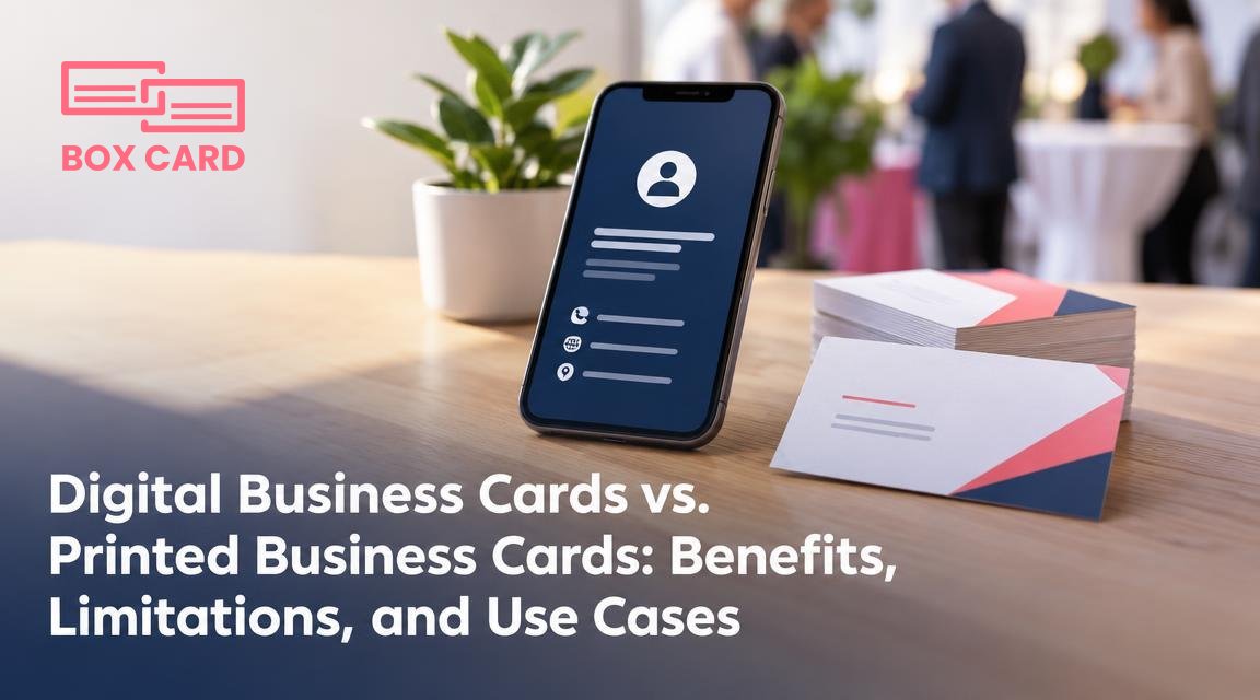
Digital Business Cards vs. Printed Business Cards: Benefits, Limitations, and Use Cases
Deciding between digital and printed business cards is about matching the medium to your goal: impression, accessibility, or measurable follow-up. This article gives a practical checklist, hybrid workflows, and common mistakes to avoid so you can choose the right mix for each situation.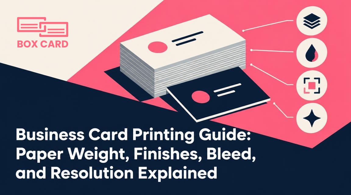
Business Card Printing Guide: Paper Weight, Finishes, Bleed, and Resolution Explained
This practical printing guide explains how paper weight, finishing options, bleed, and image resolution change the look, cost, and usability of business cards. Use the quick rules and checklist to prepare print-ready files and pick the right materials for your goals.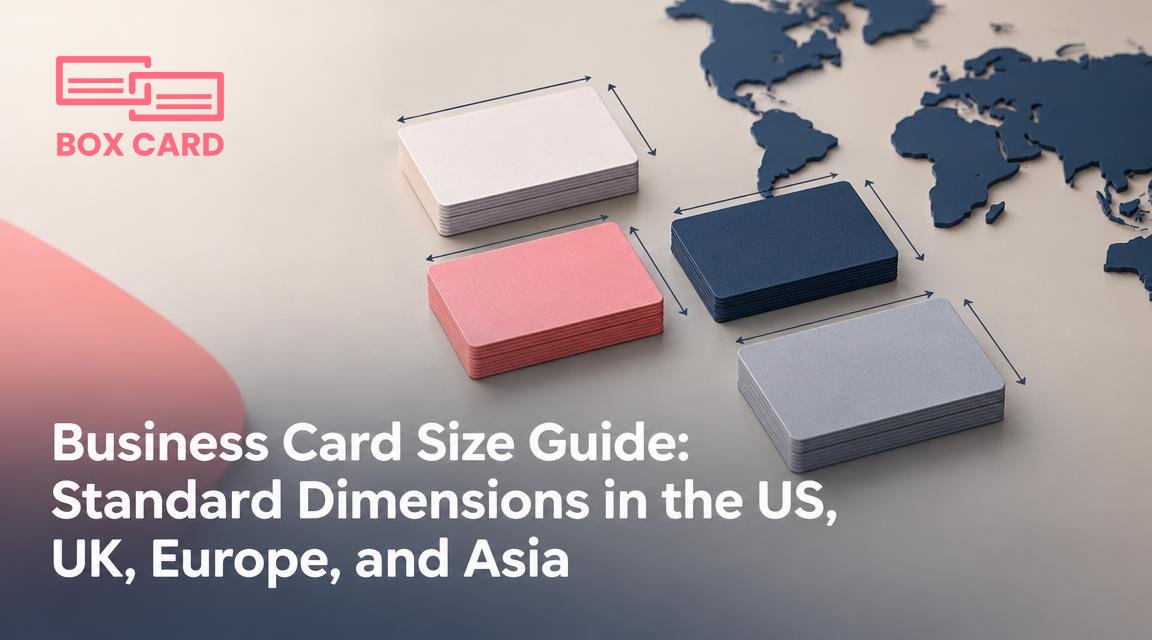
Business Card Size Guide: Standard Dimensions in the US, UK, Europe, and Asia
Pick the local standard size first, then design to that canvas. This prevents storage and printing problems, and ensures legibility and predictable layout when you hand out cards across borders.
How to Design a Professional Business Card That Reflects Your Personal Brand
A practical framework for turning a personal brand into a clear business card: decide one dominant impression, pick color and typography rules, and prioritize the single action you want recipients to take.
Creative Business Card Design Ideas for Consultants, Entrepreneurs, and Freelancers
Specific card treatments for consultants, entrepreneurs, and freelancers, with clear trade-offs, production tips, and simple ways to track which creative design actually generates leads.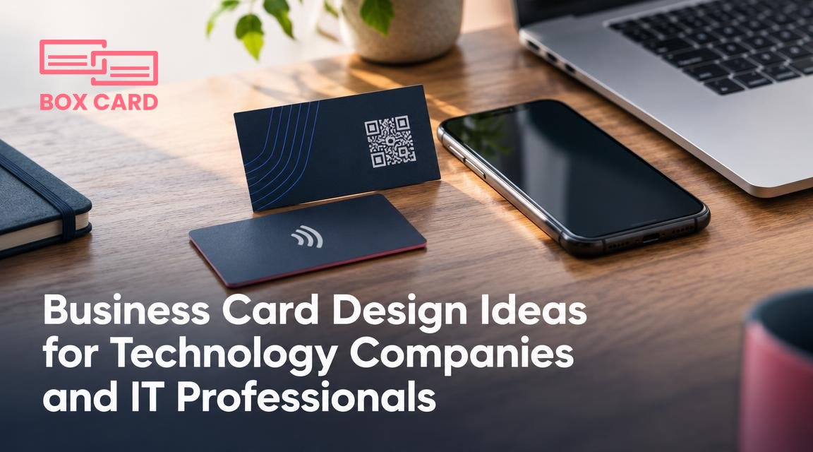
Business Card Design Ideas for Technology Companies and IT Professionals
Design a card with one clear purpose, then match visuals, materials, and interactivity to that goal. Pick a single mobile-ready link, make contact details easy to import, and test a small print run at events before ordering large quantities.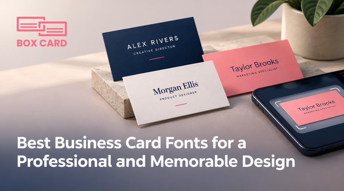
Best Business Card Fonts for a Professional and Memorable Design
Choose typefaces that stay readable at small sizes, reproduce well with your chosen print method, and scan reliably. Test two versions: one for visual impact and one optimized for clarity and OCR.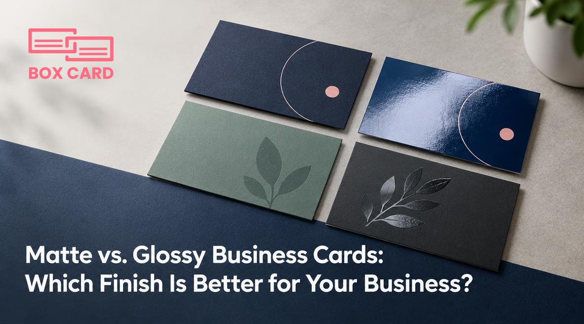
Matte vs. Glossy Business Cards: Which Finish Is Better for Your Business?
Choose a finish based on what the card must do: readability and writing, color and photographic punch, or premium tactile impression. Test physical proofs for writing, scanning, and scuffing before ordering a large run.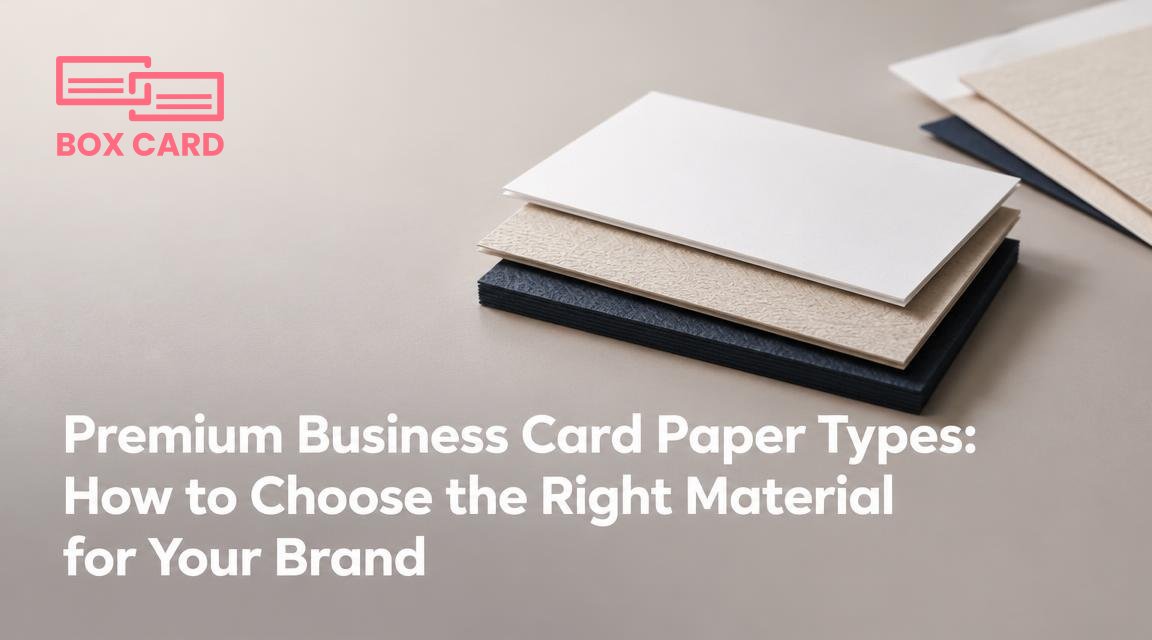
Premium Business Card Paper Types: How to Choose the Right Material for Your Brand
The paper you choose sets a tactile first impression. This guide explains the attributes that matter, how common premium stocks behave with printing techniques, and a clear decision flow so your card looks and feels like your brand.