Premium Business Card Paper Types: How to Choose the Right Material for Your Brand
The paper you choose sets a tactile first impression. This guide explains the attributes that matter, how common premium stocks behave with printing techniques, and a clear decision flow so your card looks and feels like your brand.
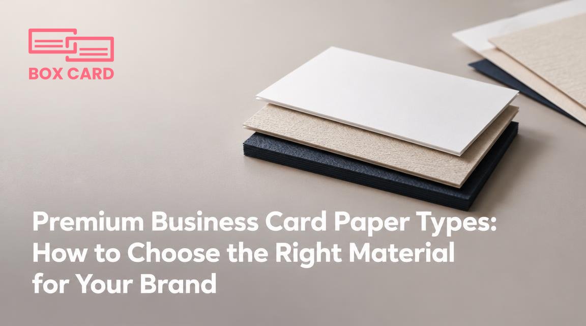
Choosing the right material for a premium business card is not an aesthetic luxury, it is a branding decision. The paper you pick affects the card's weight in the hand, how ink and finishes appear, and the impression your company gives before a single sentence is spoken. This article walks through the attributes that matter, the common premium paper types, and a simple decision flow so you end up with a card that reads like your brand, not a guessing game.
Why paper choice matters for a premium card
People decide whether a contact is worth following up with in seconds. A stiff, textured card can read as trustworthy and artisanal, while a thin glossy card can feel cheap even if the design is excellent. Beyond perception, paper affects production: some stocks take foil stamping and letterpress well, others will show fingerprints or curl under heavy varnish. Think of paper as part of the message, not just the surface for ink.
Core attributes to decide on
- Paper weight (paper weight gsm): Measured in grams per square meter. 300 to 600 gsm is typical for premium cards. Higher gsm gives rigidity and a luxurious feel, but increases cost and can affect mailing.
- Finish: coated vs uncoated: Coated papers have a sealed surface that produces crisper images and accepts spot UV and foil polishing. Uncoated papers feel more natural and accept tactile techniques like letterpress or thermography better.
- Texture: Smooth, matte, linen, cotton, or laid textures change how ink sits and how the card feels. Textured card stock hides fingerprints and communicates craftsmanship.
- Color and whiteness: Bright white makes colors pop. Natural or warm whites suit luxury brands that avoid clinical sharpness. Colored or black stocks require different printing approaches.
- Sustainability: Recycled and FSC-certified stocks can support an eco message, but recycled papers often have lower whiteness and slightly rougher surface, which affects color reproduction.
Common premium paper types and what they communicate
Below are practical summaries so you can match stock to brand intent.
| Paper type | Typical gsm | What it communicates | Printing and finishing notes |
|---|---|---|---|
| Matte coated (silk) | 300 to 450 | Modern, understated premium | Great for crisp color, works with foil and spot UV; prone to fingerprints if very dark |
| Soft-touch coated | 350 to 540 | Luxurious, velvety feel | Combines matte look with a tactile finish; can be more expensive; avoids glare |
| Uncoated cotton (100% cotton, mould-made) | 350 to 600 | Artisanal, high-end, traditional craft | Excellent for letterpress and deep emboss; colors appear softer; absorbs ink more |
| Textured linen or laid | 300 to 450 | Heritage, bespoke, professional | Pattern shows through light ink; avoids fingerprints; good for foil and embossing |
| Recycled uncoated | 300 to 450 | Ecological, honest, less flashy | Color reproduction less saturated; choose design accordingly |
| Coloured or black board | 350 to 600 | Bold, contemporary, high-contrast | Often requires foil or white ink; test readability and edge finish |
Match paper to printing processes and finishes
Choose paper with the production method in mind. A mismatch is the most common source of disappointment.
Letterpress
Best on soft, high-cotton stocks that compress under press to create a deep impression. Avoid coated papers, which resist the impression. Typical choice: 100% cotton, 350 gsm or higher.
Foil stamping
Works on many surfaces, but foil adhesion and sharpness vary. Smooth coated papers yield crisp results for thin lines. Textured stocks can produce interesting, irregular foil effects that suit artisanal brands.
Spot UV and raised varnish
Need a smooth coated surface for a clean shine. Spot UV on uncoated paper can look matte and irregular, which may be desirable but is less predictable.
Embossing and debossing
Require a sturdy stock and often a softer backing to hold the impression. Heavy gsm reduces the risk of tearing or cracking along the impression.
Digital and offset printing
Digital works well for short runs and variable data on many premium stocks; offset generally produces richer color on coated papers and is cost-effective at volume. Always request a press proof for color-critical work.
Budget and sustainability trade-offs
- Cost drivers: gsm, cotton content, and specialty finishes increase price. Letterpress and foil add setup costs. Short runs with complex finishing are expensive per card.
- Where to save: Use a standard size and avoid excessive die-cutting. Consider digital printing with a soft-touch laminate instead of multiple finishes. Order higher gsm only if the feel matters to your brand.
- Eco choices: Recycled stocks and FSC-certified papers support sustainability messaging. If color fidelity is important, test how your palette appears on recycled paper before committing.
Common mistakes and how to avoid them
- Choosing paper from photos alone. Always request physical swatches and printed proofs.
- Ignoring printer recommendations. Printers know which stocks work with their presses and finishes; consult them early.
- Overloading a design with heavy ink coverage on uncoated stock. That can cause show-through, longer drying times, and uneven finish.
- Skipping edge treatments. Painted or deckled edges add perceived value, but require thicker stock and extra cost.
A simple decision flow to pick the right material
- Define the primary impression you want: modern, luxury, artisanal, or eco.
- Choose finish family: coated for crisp color and modern look, uncoated for tactile and artisanal, textured for heritage feel.
- Pick paper weight: 300 to 350 gsm for a solid premium feel; 400 to 600 gsm for very substantial luxury cards.
- Match to production: confirm letterpress, foil, or spot UV compatibility with your printer.
- Order swatches and at least one printed proof before the full run.
Choosing the right paper is choosing how your brand feels before your voice appears. Test, touch, and proof; that three-step check prevents most surprises.
If you are planning a first run, order three variants: one uncoated cotton, one soft-touch coated, and one recycled stock. Print the same design on each and compare by holding the cards, testing legibility under different lights, and checking how finishes like foil or embossing behave. That comparison will tell you which paper actually conveys your brand, rather than which one looked best on a screen.
Next step: request physical swatches from your chosen printer, specify the exact gsm and finish, and get a press proof with your final artwork and production choices. A single proof saved from a poor match is worth the small extra cost.

