Best Business Card Fonts for a Professional and Memorable Design
Choose typefaces that stay readable at small sizes, reproduce well with your chosen print method, and scan reliably. Test two versions: one for visual impact and one optimized for clarity and OCR.
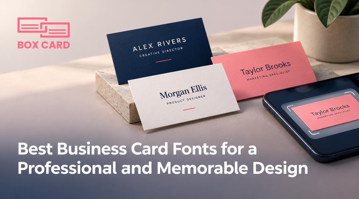
You have one small rectangle to represent you or your company. The wrong typeface can make a well-designed layout feel unprofessional, unreadable, or simply forgettable. This article helps you choose business card fonts that look right on paper, perform well when scanned or photographed, and fit specific professions and printing methods.
What matters most when choosing a font
Focus on four practical constraints: legibility at small sizes, how the font prints, the message it communicates, and whether it plays nicely with scanning or OCR. Ignoring any one of these leads to cards that look good on screen but fail in the real world.
- Legibility: Text on business cards is small. A name, title, phone number and address must remain readable at 7 to 11 point. Choose clear letterforms and avoid overly condensed or extremely thin styles.
- Print fidelity: Fine hairlines, tight counters, or extreme contrast can break when letterpress, foil, or low-resolution printers are used. Test fonts with your intended print method.
- Brand fit: Serif conveys tradition, sans serif looks modern, and display scripts read as decorative or personal. Pick a voice appropriate for your industry and audience.
- Scan and digitize behavior: If you expect contacts to be photographed or imported into a contact manager, choose fonts that OCR handles reliably: simple, widely used sans serifs or neutral serifs.
Font recommendations by category and why they work
Neutral sans serifs, best for legibility and scanning
- Helvetica: Clean, neutral, excellent at small sizes. Works well for conservative and creative fields alike. Its even stroke widths make it resilient to printing and scanning.
- Arial: A practical alternative to Helvetica. Slightly wider letterforms improve legibility in tight layouts.
- Avenir: Modern with a bit more personality, good for creative professionals who want a contemporary but readable look.
Classic serifs, best for tradition and authority
- Garamond: Elegant and compact. Use for names or logos where a refined tone matters. Avoid super-fine cuts for very small text.
- Georgia: Designed for screen readability but prints strongly at small sizes. A safe serif when you want warmth without fragility.
Geometric and humanist sans, best for friendly modern brands
- Futura: Distinctive geometric shapes. Works well as a display for names, but check numbers and punctuation used for contact details.
- Proxima Nova: Popular for branding, broad range of weights, and good small-size clarity.
Display and script fonts, use sparingly
- Script or handwritten fonts can make names feel personal, but never use them for contact details. Reserve scripts for a single element such as a signature or headline, and always test legibility at the final size.
When a monospaced or novelty font is appropriate
- Monospaced fonts, like Courier or Inconsolata, can suit tech or coding professions for stylistic effect, but they waste space and rarely improve legibility on small cards.
Practical font pairing rules
Most business cards use two typefaces: one for the primary identity (name or logo) and one for supporting details. Follow these rules:
- Contrast, not conflict: Pair a serif with a sans serif to create contrast. For example, Garamond for the name and Helvetica for contact details creates hierarchy without visual noise.
- Limit to two families: Using three or more fonts dilutes the card. If you must add a third, use it only for a small decorative element.
- Match x-height and weight: Choose fonts with similar x-heights so lines of type look balanced. Avoid pairing a very tall, narrow face with a short, heavy one.
- Maintain consistent rhythm: Use the same font for similar information across cards so recipients can scan details quickly.
Sizes, spacing, and weights that actually work
- Name or brand: Typically 10 to 14 point, depending on typeface and layout. If your logo occupies the space, the printed name can sit smaller.
- Contact details: 7 to 9 point is common. If you need smaller text, choose a font with more open counters like Georgia or Arial.
- Tracking and leading: Slightly increase tracking for all-caps details. For multi-line contact blocks, increase leading by about 10 to 15 percent to avoid crowding.
- Weight choice: Use regular or medium for body text. Heavy weights for small text can fill counters and reduce legibility, while ultra-light fonts can vanish in print.
Printing constraints and font choices
Different print methods affect how a font reads:
- Letterpress and engraving: These techniques emphasize stroke contrast and texture. Choose typefaces with generous counters and avoid very fine hairlines.
- Foil and embossing: High contrast faces can look dramatic, but tiny serifs and thin strokes may not reproduce. Test a proof before a full run.
- Digital or offset printing: Most modern sans and serif families will print reliably. Still, check a press proof when using very small sizes or pale colors.
Why OCR and business card scanning matter to your font choice
If recipients will photograph your card to save contacts, choose fonts that OCR software recognizes with fewer errors. Neutral, widely used sans serifs and common serifs are safer. Decorative letterforms, tightly tracked text, or odd punctuation increase OCR mistakes and force manual editing after business card scanning.
Common mistakes and how to avoid them
- Too many fonts: Choose one or two. Excess creates visual noise and harms brand recall.
- Ignoring legibility tests: Always print a sample at actual size and view at arm's length. What looks readable on screen may blur in print.
- Using novelty fonts for contact details: Scripts or display faces can be pretty, but they slow someone trying to copy your email or number.
- Not checking font licensing: Commercial use of a typeface may require a license. Verify licensing before producing large quantities or embedding fonts in digital assets.
A short decision checklist to pick the right font now
- Define the personality you need: conservative, modern, friendly, or creative.
- Select one primary typeface and one complementary typeface, following the contrast rule.
- Set sizes: name 10 to 14 point; contacts 7 to 9 point. Adjust for the specific face.
- Print a physical proof and view at normal reading distance; correct spacing and weight if needed.
- Photograph the proof and run it through the scanning method you expect recipients to use. If OCR mistranscribes important fields, choose a clearer face.
A final practical step: prepare two versions of your card before ordering a print run. Version A is optimized for visual impact, with any decorative elements you want. Version B prioritizes clarity and scanability, using neutral typefaces and stronger contrast. Keep both files so you can use the right one for different situations: a designer event versus a networking lunch.

