Matte vs. Glossy Business Cards: Which Finish Is Better for Your Business?
Choose a finish based on what the card must do: readability and writing, color and photographic punch, or premium tactile impression. Test physical proofs for writing, scanning, and scuffing before ordering a large run.
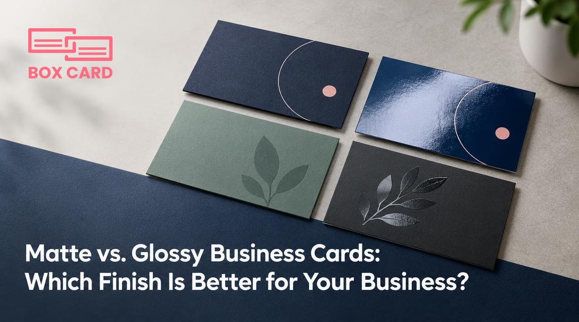
You have a design you like and a budget for printing, but one final choice remains: matte or glossy? That decision matters because finish affects how your brand reads, how easy the card is to write on, how it survives a pocket, and even whether a phone can scan the QR code. This article gives a practical way to choose a business card finish based on what you need the card to do, not just how it looks.
Quick recommendation: which finish for which goal
If you want a single-sentence rule to guide a fast decision, use this:
- Choose matte business cards when readability, handwriting, low glare, and a restrained, professional tone are priorities.
- Choose glossy business cards when you need vivid colors, strong photographic detail, or a shiny, attention-grabbing look.
- Consider a soft-touch finish when you want a premium tactile impression with muted sheen and a velvety feel.
The rest of the article explains why these choices matter, the trade-offs, and how to test before you print hundreds or thousands.
How finish changes what people perceive and how the card performs
Visual effects
Glossy coatings increase color saturation and perceived contrast, so photos and bold color blocks look richer. Matte keeps colors more subdued and can enhance small type by reducing reflected highlights that blur edges. A spot gloss or spot UV coating can be applied selectively to add shine on a matte background, which highlights logos or elements without making the whole card reflective.
Tactile and practical effects
- Glare: glossy cards reflect light, which can make them harder to read under strong directional light. Matte reduces glare and is easier to read in most lighting conditions.
- Writing: most matte surfaces accept pen ink reliably. Glossy surfaces are harder to write on with ballpoint pens; some need a permanent marker.
- Fingerprints and scuffs: glossy finishes show fingerprints and scratches more visibly. Matte and soft-touch hide fingerprints but can pick up scuffs or rub marks over time.
- Perceived quality: soft-touch finish feels premium and signals high value. High-gloss can feel flashy, which suits certain brands but may feel cheap for others depending on paper stock and design.
Scanning and digital capture
If you expect recipients to scan your card with a phone app for business card scanning or OCR, matte and soft-touch finishes are safer choices because they reduce glare and specular highlights that confuse cameras. If you must use glossy, test scanning under several lighting conditions before finalizing the print job.
Production methods and common finish types explained
Knowing the names of finishes helps you ask printers the right questions and compare quotes.
- Unglossed matte (aqueous matte varnish): a water-based coating that gives a low sheen and protects the card. Cost-effective and recyclable in many workflows.
- Glossy varnish or lamination: adds shine and color pop. Full gloss lamination is more durable against moisture but may show fingerprints.
- Soft-touch laminate: a thin laminate that gives a velvety surface and a muted look. Feels premium, but can scuff and sometimes is harder to recycle.
- Spot UV or spot gloss: shiny varnish applied only to selected areas. Combines the best of both: a matte field with glossy logo highlights for contrast.
Each method affects cost, turnaround time, and sometimes minimum order quantities. Ask the printer for finish samples and for clarification whether the coating is lamination or varnish, because that affects durability and recyclability.
Trade-offs to consider before you decide
| Criteria | Matte | Glossy | Soft-touch |
|---|---|---|---|
| Color vibrancy | Moderate | High | Moderate |
| Readability / glare | Excellent | Can be problematic | Excellent |
| Writable surface | Good | Poor | Varies |
| Fingerprints | Low | High | Low |
| Perceived luxury | Neutral | Flashy | High |
Use the table as a starting filter. If your design requires very fine type or lots of small text, matte or soft-touch will usually be the safer option. If your card primarily showcases a photograph or bold color blocks, glossy will give a stronger visual impact.
Concrete recommendations by use case
Corporate services, law, finance
Choose matte business cards or soft-touch finish. These industries value legibility and a restrained, professional look. Matte reduces glare in conference rooms and makes it easy for people to jot notes on the back.
Photos, restaurants, fashion, photography
Glossy business cards often work well because they enhance color and texture in images. If you also want a tactile premium, pair a glossy front for the image with a matte or writable back.
Creative agencies and luxury brands
Soft-touch finish signals quality and invites handling. Combine soft-touch with spot UV or foil for selective shine that catches the eye without making the entire surface reflective.
Events, trade shows, quick exchanges
Matte is practical: cards are less likely to glare under exhibition lights and are easier to write on when you collect leads. If durability matters because cards will live in wallets, consider a thicker stock with a protective laminate.
Tradespeople and field workers
Durability matters more than subtlety. Choose a heavier stock with glossy lamination if the card will endure damp or dirty pockets, but be aware that glossy will show wear differently than matte.
How to test finishes without wasting money
- Order a printed proof of your exact design in each finish you are considering. Do not rely on digital mockups alone.
- View proofs under multiple lights: office fluorescents, daylight, and direct lamp. Check for glare and color shifts.
- Attempt to write on the back with the pen your team uses. Try both ballpoint and gel pens.
- Scan or photograph the card with a phone app you expect customers to use for business card scanning or QR captures. Test at different angles and light levels.
- Rub the surface with a fingertip and try folding or bending a spare to evaluate scuffing and durability.
These checks take a few minutes per proof and will prevent costly mistakes when printing a large run.
Final decision rule and quick checklist
Use this decision rule: prioritize readability and utility when your cards will be used as working tools; prioritize visual impact when the card itself is part of a creative presentation; prioritize tactile impression when you want to signal premium service.
Quick printing checklist before you hit order:
- Have a physical proof for each finish.
- Confirm the coating type with the printer (varnish, laminate, spot UV).
- Test handwriting and phone scanning on each proof.
- Decide whether to combine finishes: for example, matte card stock with spot UV on the logo.
- Choose a paper weight that matches your finish: heavier stock improves tactile perception across all finishes.
Pick the finish that matches what you want the card to do at the moment someone first touches it and in the minutes after they leave: be readable, be memorable, or be tactile. If you cannot decide, print a small run of two finishes and compare real-world reactions from colleagues and customers before committing to a larger order.

