Minimalist Business Card Design Ideas for Modern Professionals
Practical, role-specific design templates and a production checklist to create minimalist business cards that read instantly, print reliably, and work with modern digital workflows.
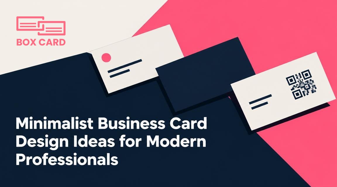
You need a business card that looks clean, reads instantly, and fits the way you work. This article gives specific, ready-to-use design ideas for people who want a minimalist business card without losing personality or function. You will find layout templates for different roles, rules for typography and color, print and material choices, digital extras to include, and a short production checklist that prevents common mistakes.
What minimalist means in practice
Minimalist does not mean empty. It means removing every element that does not serve one of these goals: identify who you are, how to contact you, or what you do. A successful minimalist business card uses space intentionally, prioritizes legibility, and contains a single clear visual hierarchy.
Three specific layouts you can use immediately
Below are three compact templates. Each is tuned to a typical professional role and includes suggested typography scale, spacing, and what to put on the back.
1. The Consultant: centered elegance
- Front: Centered name (large), job title (small, uppercase), single-color logo or monogram above name.
- Back: Contact line grouped in one row: phone, email, website. Add a tiny QR code in the lower right if you expect scanning.
- Why it works: consultants need authority and clarity. Centered layout reads as deliberate and professional.
2. The Creative: large name, minimal mark
- Front: Name left-aligned, bold type. Small logo or playful glyph on opposite corner. Generous white margin around content.
- Back: A single visual element or pattern in the same color family, used very subtly, plus one line of contact details at the bottom.
- Why it works: creatives benefit from an expressive name treatment while keeping details unobtrusive.
3. The Technical Lead: information-first horizontal
- Front: Two-column layout, left column name and title, right column contact stacked with icons removed for simplicity.
- Back: Short list of specializations or certifications, each on its own line, plus a QR code linking to a technical profile or GitHub.
- Why it works: technical contacts scan for specific credentials; a compact structured layout makes that quick.
Typography: choices that read instantly
Choose one display face and one text face at most. For a minimalist business card you want high x-height and open counters so small text remains readable after printing.
- Sans serif options: choose a neutral geometric or humanist sans for both name and details. Examples: a humanist face for warmth, a geometric face for a cleaner look.
- Size rules: name 10 to 14 point, title 7 to 9 point, contact 6.5 to 8 point depending on the type. Keep line height about 120 to 140 percent of point size.
- Letterspacing: slight tracking for uppercase titles, none or slightly negative for small caps in names.
Color and contrast: one bold choice
Minimalist cards work best when color is used as a deliberate signal. Pick one dominant color and combine it with black or very dark gray for text. If you are designing a single-color business card, use the color for either the logo or the full-bleed background and keep text in white or dark gray for legibility.
When to use which approach:
- White background, colored mark: safest for international or formal contexts.
- Single-color business card with colored stock or full-bleed: bold and memorable, good for creative fields or trade shows.
- Two-tone approach: colored edge or colored back with white front balances boldness and legibility.
Printing and materials: how to make a minimalist card feel premium
Material choices affect perceived value more than extra design ornament. Consider the following options and their practical trade-offs.
| Material | Feel and visual effect | When to choose |
|---|---|---|
| 400 to 600 gsm uncoated | Soft, tactile, reduces glare | Formal services, consultants, law |
| Coated matte | Sleek, modern, prints colors slightly deeper | Design and tech professionals |
| Colored core (edge color) | Subtle surprise when card is handled | Brand-forward creatives, sales |
| Plastic or metal | Durable, stands out, more expensive | High-end technology or luxury sectors |
Functional digital elements: include only what adds value
A minimalist design should still work in digital workflows. Here are practical digital extras and how to add them without clutter.
- QR-enabled business card: place a small QR code on the back, sized about 2 to 2.5 cm square. Test scanning on glossy and matte stocks before ordering a large run.
- vCard link: the QR code should link to a single vCard or a short landing page. Avoid linking to a general homepage that requires extra navigation.
- Scan friendliness: avoid thin hairlines and very light colors for contact text. If you expect business card scanning, keep the text contrast high and avoid decorative fonts for the contact block.
Common mistakes and how to avoid them
- Using too many contact methods: choose two primary ways to be reached, for example email and mobile, plus one digital link via QR code.
- Tiny logo, unreadable name: the hierarchy must place name and contact as primary elements, not the logo.
- Relying on embossed or foiled microtype: decorative effects are fine, but avoid them on small text or dense contact information.
Quick production checklist
- Proofread every line of contact info aloud. Confirm phone numbers and email addresses.
- Check contrast: print a grayscale proof to confirm legibility of small text and QR code.
- Ask for a paper sample or swatch of the chosen stock.
- Test-scan the QR code at final print size and on the chosen finish.
- Order a small initial run of 50 to 100 cards before committing to 500 or more.
If you want to iterate quickly, make two versions: a conservative white-front version for formal meetings, and a single-color business card as a bold option for networking events. Keep the same typography and layout in both versions so the brand reads consistent across contexts. When you combine these design choices with a short production checklist, you end up with a minimalist business card that is readable, durable, and appropriate for modern professional situations.
Next step: pick one template above that matches your role, choose one color, and create a single mockup. Print a five-card proof and carry only those for a week. The feedback you get after real exchanges will tell you which small change matters most.

