Business Card Design Trends in Japan, South Korea, and Singapore
Design for each market by treating Japan, South Korea, and Singapore as distinct audiences. This article gives concrete visual, typographic, and production decisions you can test before printing a full run.
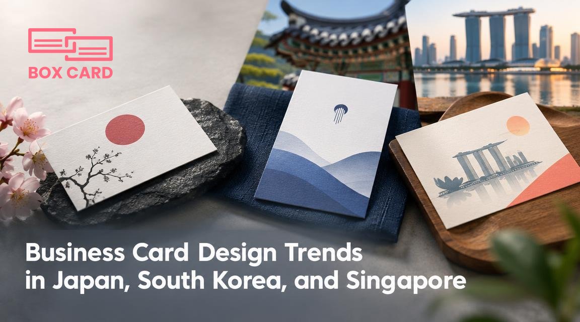
You are preparing business cards for meetings in three different markets: Tokyo, Seoul, and Singapore. The cards will sit on a table, be held during introductions, and then disappear into pockets or phone wallets. Design choices you make now will affect first impressions, readability, and how easily your contact details are preserved or digitized. This article focuses on concrete, market-specific design decisions: visual style, language and layout choices, production techniques, and simple tests you can run before a full print run.
How to read each market before you design
Start by treating each city as a different audience, not merely a different language. Ask two questions: which professional group will view the card, and how will they use it after they receive it? For example, a finance executive in Tokyo expects a conservative card that communicates stability. A startup founder in Seoul will accept bolder colors and nonstandard sizes. A business development manager in Singapore needs a card that works in multiethnic, multilingual meetings and plays well with digital follow-up tools.
Visual style and typography
- Visual tone: Subtle, restrained, and highly crafted. Minimal layouts with generous negative space feel professional.
- Typography: Clean sans serifs or modest humanist serifs. Avoid tiny condensed fonts; kanji detail needs adequate x-height and stroke weight to reproduce well on textured stock.
- Orientation: Horizontal remains standard, but vertical cards are accepted in creative circles and for certain traditional professions. If you choose vertical, make sure both Japanese and English lines read clearly when the card is held in either hand.
South Korea business card
- Visual tone: Modern and brand-forward. Strong logo presence and bold color choices are common, especially in tech and design sectors.
- Typography: Use clear Hangul-friendly typefaces. Korean characters require slightly larger sizes for legibility at small scales; test on the final paper.
- Finishes: Metallic foils, gloss accents, and spot UV for logos are popular among creative agencies and consumer brands.
Singapore business card
- Visual tone: Practical and cosmopolitan. Cards often balance Western minimalism with regional cues, because recipients come from many language backgrounds.
- Typography: English is typically the primary language. Use a neutral, highly legible sans serif. If you include Chinese, Malay, or Tamil, ensure those glyphs match your chosen font family or are set in a complementary face.
- Durability: Because cards travel, consider slightly thicker stock or coated finishes that resist moisture and wear.
Language, name order, and layout decisions that affect design
These are design decisions with cultural consequences. Treat them as strategic choices rather than default settings.
- Language priority: For most international meetings in Singapore use English first. In Japan and South Korea, a bilingual layout is often prudent: native script first, English translation below or to the side. Decide which language occupies visual priority and design accordingly.
- Name presentation: If your card includes a native script and English, place the native script where it will be read first by local recipients. That choice affects type size, line length, and orientation.
- Titles and departments: Instead of long job descriptions, use a short, clear title that fits one line. Longer information can go on the back or be included in a linked digital profile.
Material choices and printing techniques
Paper, finish, and special effects are part of the visual language. They communicate intent: conservative, premium, or playful. Here are practical trade-offs.
- High-quality textured stocks: Convey craft and formality. In Japan this remains a common cue for seriousness. Textured stock reduces glare but can slightly soften fine type. Increase stroke weight if you choose this paper.
- Coated and water-resistant finishes: Useful in Singapore where humidity and travel are common. They keep cards looking new longer and are easier to scan when photographed.
- Foil, embossing, and spot UV: Visually striking, especially in South Korea creative sectors. Use them sparingly; heavy metallics can interfere with OCR and contact-scanning.
- Unusual sizes: Make a card memorable, but check printing and digital scanning compatibility first. Slim or square cards may not fit standard card holders and may photograph poorly for quick digitization.
Integrating digital elements without breaking design
All three markets accept QR codes and digital contact sharing, but how you integrate them is a design decision.
- QR codes: Place them on the back, sized for reliable scanning. Keep quiet space around the code and avoid decorative treatments that alter the code area.
- NFC chips: Invisible and slick, they are appreciated in tech-forward circles in Seoul and Singapore. Plan for a discrete logo or small note that indicates the presence of NFC.
- Short URLs and social handles: Use only one or two, and test that they work without trailing punctuation. In multilingual cards, keep the digital contact language consistent with the primary language on the front.
Sector-specific examples and quick mockups to try
Choose one of these starting points and adapt type, color, and finish based on your brand and audience.
- Finance executive in Tokyo: Two-sided card, native script and English, textured off-white stock, restrained serif for name, sans for contact lines, no QR code on the front.
- Startup founder in Seoul: Single-sided, strong brand color, large logo, Hangul and English, spot UV on logo, QR code on the back to a live pitch deck or LinkedIn.
- Regional manager in Singapore: Bilingual English and Mandarin, coated stock, compact contact block with phone, email, and company site, small NFC indicator for seamless contact transfer.
A practical preflight checklist before you print
- Legibility test: Print a 1:1 mockup on your office printer. Hold it at typical viewing distance and at the size of a folded wallet. Check Hangul and kanji character clarity.
- Scan test: Photograph the mockup under daylight and low light, then scan the QR and try OCR with your contact app. If you use a service like Boxcard to digitize, confirm it captures names, titles, and numbers correctly.
- Material sample: Order a small swatch pack from your printer to compare tactile feel and color reproduction under different lights.
- Proof for color and logo: Ask for a hard proof, not just a PDF, if you are using metallics or spot colors that can shift between monitors and presses.
Small visual decisions have outsized impact. A legible Hangul set in too-light weight is worse than a conservative design that reads easily.
If you are making cards for multiple markets, prefer a common visual system with localized variants: same logo, consistent color palette, but adjusted type sizes, language order, and finish. Once you have printed a small batch, use a digitizing app to store and share samples, and keep notes on which combinations performed well in real meetings.
Practical next step: pick one market, create a 10-card prototype with the choices above, run the legibility and scan tests, then iterate. That single loop will save wasted print runs and produce cards that not only look right, but actually work in the hands of local professionals.

